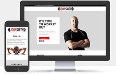
Welcome to the dynamic world of personal training, where sweat meets strategy, and dedication fuels transformation. As a personal trainer, your mission is clear: sculpt healthier lives, one rep at a time. But here’s the twist – your impact extends beyond the gym floor. It reverberates through the digital realm, where your website becomes the ultimate workout partner.

The Digital Dumbbell: Why Your Website Matters
Picture this: a potential client, sweaty palms clutching a smartphone, brows furrowed in search of the perfect personal trainer. They’re navigating the intricacies of the internet, seeking more than just a fitness guru. They want a guide, a motivator, and a results-driven ally. And guess what? Your website is their first impression – the virtual handshake that determines whether they’ll sprint towards you or click away.
The Art of Crafting Your Digital Sanctuary
1. The Homepage: Your Fitness Studio’s Grand Entrance
Think of your homepage as the red carpet rolled out for your visitors. It’s not merely a landing page; it’s the heartbeat of your online presence. Keep it clutter-free, like a well-organized gym. A succinct headline – “Unlock Your Potential” – paired with a captivating image sets the tone. Remember, brevity is your burpee buddy here.
2. About Me: The Personal Trainer’s Origin Story
Clients crave connection. They want to know the sculptor behind the dumbbells. Craft an About Me page that’s more than a resume. Share your journey – the sore muscles, the breakthroughs, and the “aha” moments. Be conversational, empathetic, and occasionally humorous. After all, you’re not just a trainer; you’re a life architect.
3. Services: Your Fitness Menu
Imagine your services as a buffet – each dish tailored to a specific craving. Create a menu that caters to diverse appetites. From one-on-one sessions to virtual boot camps, showcase your offerings like a Michelin-starred chef. Use idioms, metaphors, and natural dialogue. Let them taste success before they even sign up.
4. Testimonials: Sweat-Stamped Seals of Approval
Testimonials are your squats – they strengthen your credibility. Feature real clients, their before-and-after stories, and the joy radiating from their transformed physiques. Scatter these gems throughout your site like kettlebells in a functional training circuit. Authenticity is your protein shake here.
5. Blog: The Cardio of Content
Blogs aren’t just for fitness enthusiasts; they’re for curious minds seeking knowledge. Share workout tips, debunk myths, and dive into the science behind those lunges. Keep sentences straightforward – no need for meticulous jargon. Engage your readers like a friendly chat over green tea.
6. Contact: The GPS to Your Gym
Your contact page isn’t a maze; it’s a direct route to your fitness haven. Keep the form simple – name, email, and a “How can I help you?” box. No need for ever-evolving captchas; we’re not guarding Fort Knox. And when it comes to your location, be precise – “In the heart of Downtown Fitnessville.”
The Sweat Equity: SEO, Mobile Optimization, and Speed
Your website isn’t just eye candy; it’s a search engine’s playground. Ensure it’s SEO-friendly – sprinkle keywords like protein powder. Mobile optimization? Non-negotiable. More people browse on phones than bench press at the gym. And speed? A slow website is like a treadmill stuck at a 2 mph crawl – frustrating and counterproductive.
The Final Rep: Call to Action
Every fitness class ends with a cooldown stretch. Your website should too. A compelling call to action – “Ready to crush your goals? Let’s chat!” – nudges visitors towards the dumbbell rack of commitment. Be their fitness whisperer, urging them to lift more – not just weights but aspirations.
Remember, your website isn’t a mere URL; it’s your digital sweat equity. So, lace up those virtual sneakers, flex those HTML muscles, and sculpt a high-performing personal trainer website that leaves visitors breathless – in a good way.
Now, go conquer the digital treadmill, my fellow trainer. The world is your gym, and your website is the ultimate workout playlist
In my opinion, personal fitness trainers must opt for a one-page website design.
Why Choose Our One-Page Fitness Website Design?
- Affordability: No hefty membership fees here. Our one-page design fits your budget like a snug workout tee.
- Speed: Blink, and it’s loaded. Your clients won’t wait; neither should your website.
- Engagement: We’ve sprinkled engagement like protein powder. Conversational, relatable, and ready to convert.
- Results: More bookings, more clients, more sweat. Isn’t that the ultimate goal?
So, lace up those virtual sneakers, my fellow trainer. Your website isn’t just a URL; it’s your digital sweat equity. Let’s sculpt success, one pixel at a time. Ready to flex? Let’s build your fitness empire.


